JetBlue Tail-Fin Pattern Exploration
Self-initiated exploration · year unconfirmed · unpublished
Designer and art director: Paul Morris
A tail fin is an airline's most-seen surface and JetBlue gives every aircraft a different one, so a pattern set has to survive at fin scale, again on a T-shirt, and again beside a wordmark it must never compete with.
What I made
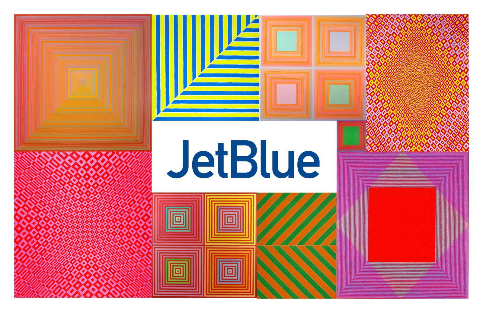
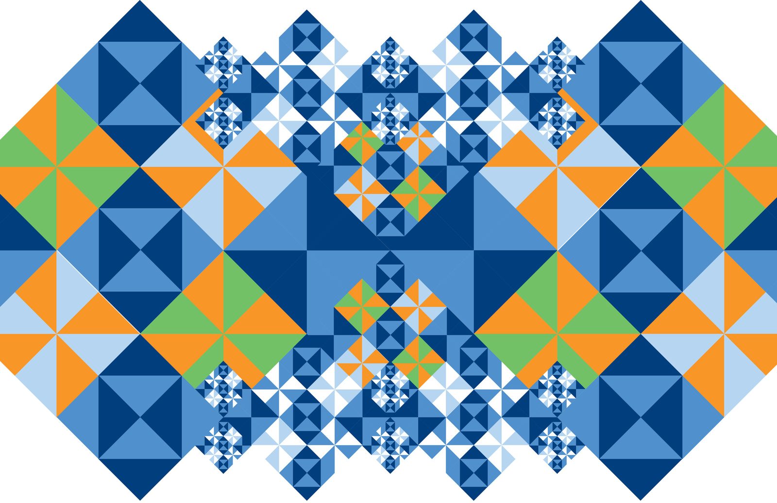
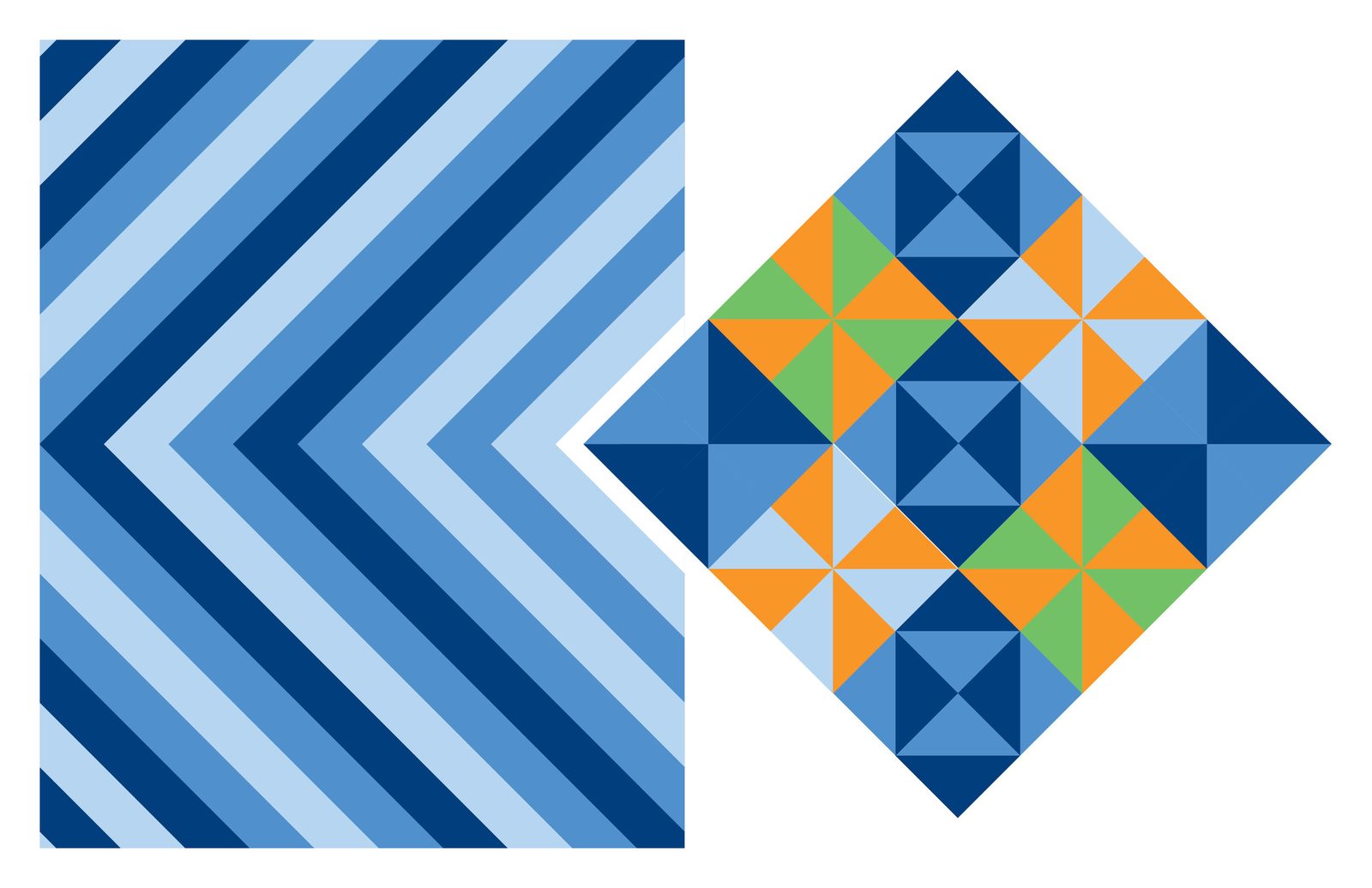
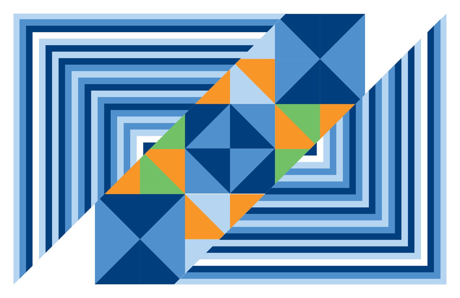
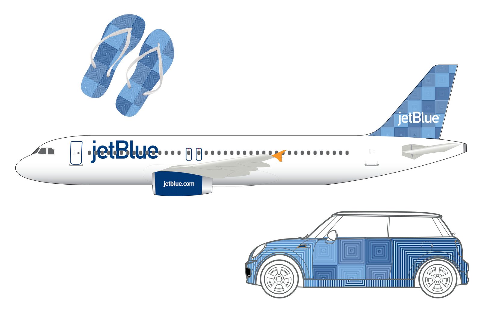
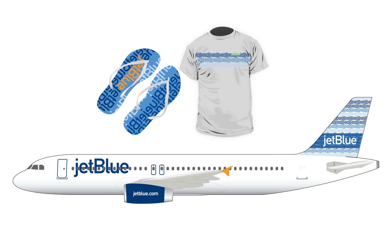
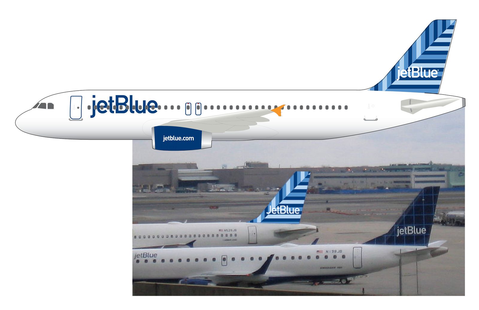
Twelve boards. A library board holds twelve colourways around the JetBlue wordmark knocked out white at the centre. Individual boards then push single systems to fin scale: interlocking triangles in blue, orange and green; a chevron field beside a rotated checkerboard diamond; concentric bands meeting a triangle grid; a moiré of embossed squares. The last boards apply them — a painted tail fin, a T-shirt, flip-flops, a patterned Mini, and a full livery mock-up composited above parked aircraft on a tarmac.
Taking projects from October. Editorial, campaign and digital art direction.